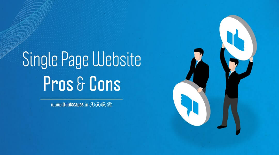
Single Page Website Pros and Cons
Websites are central to digital marketing. The bulk of the initial investment goes into developing a purposeful website. So, it’s no wonder that the emergence of the single-page website as a more cost-effective, convenient, and target-oriented alternative to the conventional website has created a new trend in digital marketing.
But as all good things come at a cost, a single page website has some drawbacks, which makes multi-page websites more suitable for certain conditions. In this blog, we will discuss single page vs. multi-page website with some single-page website examples to understand the one-page website benefits and its drawbacks.
What is a One-Page Website Design?
A website that only has one HTML page is referred to as a single or one-page website. No other pages, such as an About, Features, or Contact Us page, are present.
The user experience is made more continuous and fluid by the fact that content on single-page websites is fully loaded on the first page. Users can scroll down a single-page website to find various content sections, or they can click navigation links that let them jump to specific locations on the page.
Single Page Website Benefits
#1.Simplicity and Ease of Use
The fact that single-page websites contain everything in one page, makes them simple to use and one of the main factors contributing to their popularity. There isn’t much that is simpler than a one-page website that has a distinct introduction, middle, and conclusion.
A one page website design is ideal for websites with a single purpose due to its simplicity of use. The linear experience of this design helps to muster more attention from the users on your product or story
People are realizing how helpful it can be to navigate a single-page website. There is more scrolling and less clicking on one-page designs. Single page scrolling website is advantageous because more users will likely stay on your site because they prefer scrolling to clicking. One-page designs offer a seamless and intuitive user experience as long as the design is kept simple and uncluttered.
#2. Greater User Engagement
It’s simple to understand that users get more engaged with one-page websites because they are just that—one page. Users will receive messages and calls to action more quickly on a one-page website. Because users are only interacting on one page, responding to your website’s calls to action is simpler.
Because they are all in one location, they don’t have to look far to find a contact form or buttons that lead to your social media accounts. Additionally, since users are more likely to stay on your website longer, since they only need to scroll down one page as opposed to trying to navigate through pages, subpages, etc., due to our increasingly short attention spans.
ORM, Virtual Financial Services, ATL/BTL Marketing, Project Management, Brand Management, SEO, Web & App Development and much more.
*Your details are safe with us. We do not share or spam our valuable visitors*
Interested to find out how we could help you? Drop in your email and number and we’ll get right back!
#3.More Attention to Quality
With one-page websites, digital storytellers can create linear stories that are easy to read. One-page designs concentrate attention on a single page, giving content more bandwidth (and often more money). In comparison, multi-page websites offer fewer opportunities for creativity because each page must be optimised and quality is often overemphasized.
A one-page layout also offers more space for images. Designers can tell a story using a variety of media, creating a more immersive experience for the user, rather than worrying about stuffing a page with content. Instead of worrying about making logical connections, the focus is on the content.
#4. Results in More Conversions
Since better user experience results in higher conversion rates, the one-page design scores much higher in terms of conversions. Conversion into sales should be your top priority when building a website to generate leads, sell goods or services, or even build an email list. A one-page website increases the likelihood that a user will take the desired action.
One page reduces options and minimizes distracting factors. Your visitors won’t unintentionally switch to another page and forget to click CTA. The slow loading of pages won’t frustrate them after they decide to buy. It’s all right there on the page, and if your content is compelling enough, they won’t hesitate.
#5. Easy to Access with a Mobile Device
Another strong factor that makes single-page websites more on demand in many situations is that they can be accessed rather easily using a mobile device. In sharp contrast, multi-page websites will be very slow to load, which makes most users leave rather than deal with the hassle. The one-page design is by far the simplest to use on any type of device, even though many multi-page website designs are responsive and optimized for mobile support.
#6. More Affordable and Easier to Maintain
A single page website will generally be less expensive to build and maintain, even though the layout strategy may require a little more time and work. A single page website could be designed and built within just 10-15 hours, as opposed to a multi-page website, which could take three times as long.
One-page websites are also simpler to maintain. Everything that needs to be fixed, altered, added, or removed is on one page. For website owners who don’t consider themselves experts in web design, this is especially helpful. For instance, if you choose WordPress as your web platform, you will only need to edit one page (with various buckets and sections). When your website goes live, the developer you work with should be able to show you how to maintain it.
Drawbacks of One-Page Websites
#1. Difficult for Keyword Optimization
The number of keywords is a major factor in search engine optimization. In a single-page website the scope of keyword optimization is limited. You need to take a specialized approach to SEO if you intend to use a single page website. You must first pick your keywords carefully because you can only use a limited number. A page with an excessive number of keywords is considered spam, and search engines do not support spam.
To make up for this problem, you’ll have to put in more effort to make sure that:
- Your site loads quickly,
- Your content is of the highest caliber (since you have fewer keywords to choose from),
- You build lots of links.
On a one-page website, it is possible to have good SEO, but you will undoubtedly have to put in extra effort. Remember search engines prefer content-rich, simple-to-read websites that focus on a single subject, which can match the features of a one-page website.
#2. Not Ideal for Sharing
This disadvantage results from the fact that it’s a challenging task to share information distinctly when there is a lot of it on a single page. Many times, only the top part of the page comes up when a user chooses to share your website, while the information intended to be shared belongs to the middle or lower parts.
There are, of course, inventive ways to get around this. For instance, you could place social sharing buttons on particular sections of the page, but that would require some specialized coding and might make the page look cluttered. You are faced with the challenge of finding balance once more.
#3. Difficult to Use Analytics
Although usability testing can be used to improve a one-page design, it will be difficult to run most other analytics options. Google Analytics will only be able to determine who your visitors are and how long they spend on the page. But because it is a single page, it cannot determine which parts of the page are being most actively used by visitors.
This presents difficulties on many levels. It is challenging to increase conversions with fewer analytics (although single-page designs tend to have better conversions). It also becomes difficult to figure out why visitors are leaving, which might lower bounce rates and have a direct effect on SEO.
#4. Scalability is Compromised
On a one-page website, you don’t have much option to add more content if required in future. To maintain the same page length, one option is to replace any existing content. Another option is to jam as much information as possible onto a page, which will make users scroll much further. Or, you can choose to make your website more extensive by adding additional pages.
One Page Website Examples
Cook Collective offers the entire kitchen and storage space on rent. This provides excellent opportunities to start and flourish a food business at minimum risk. It can be availed by virtual restaurants as well as by street vendors. The website communicates all of this information on a single page.
#2. whatisBeyond.com
Beyond is a music festival that promises spiritual and immersive experiences. This is conveyed on a one-page site with an outstanding header image. As you scroll down the page, you’ll learn more about the festival and its past participants.
One-page websites can be ideal for promoting events. There may be less amount of text if the design requires so, to match the context or subject. You can use a large and attractive header image to draw the user in, and keep their attention with high-quality photos throughout the rest of the page, as shown by Beyond.
#3. Roma
Roma is a one-page website that educates the public about the exploitation of domestic workers. The site welcomes visitors with a full-width image and bold statement. The content lets you walk through the story without any disruption but provides three important links – Take Action, Roma Documentary on Netflix, and to jump to the next section. This helps you to navigate swiftly to any part you want.
One-page sites are ideal for promoting documentaries and films, as illustrated in The Art of Texture. Provide more context by embedding them into your page and adding additional elements, such as a blurb and images.
The website is devoted to a documentary about a college artist. A click on the Play Movie button will let you watch the documentary directly on the page. Also, there is a slideshow and a gallery of artworks on sale.
ORM, Virtual Financial Services, ATL/BTL Marketing, Project Management, Brand Management, SEO, Web & App Development and much more.
*Your details are safe with us. We do not share or spam our valuable visitors*
Interested to find out how we could help you? Drop in your email and number and we’ll get right back!
Source- Fluidscapes
We are one of the best digital marketing companies in India that provides online reputation management services to all types of organizations. We assist businesses to stay on top of the game by leveraging the latest technologies and breakthroughs in marketing strategies and business processes. Want to grow your business, even more, get in touch with us and we’ll tell you how.
POPULAR BLOGS
TOP 5 Domains of AI Insider Secret
As AI continues to be among the most talked about subjects of modern times and …
How an ORM Agency Can Help Protect and Enhance Your Online Reputation
Your reputation is your best asset, for an individual or for a business. The question …
ORM Agency vs. In-House Reputation Management: Which is Right for You
While ORM (Online Reputation Management) is seen as the backbone of a business’s branding strategy, …