Zomato and Swiggy Logo: A Complete Analysis of Visual Language
Brand war has become more intense and subtle by the intelligent use of visual language. The rise of Zomato and Swiggy brands can be interesting case studies as both are doing great in the same business and in the same market. An analysis of Zomato and Swiggy logos might give us a sense of how they have capitalized on visual language to bolster their positions.
Why is Visual Language so Important Today?
A visual language is a system of communication using visual elements. An image that carries a meaning can be used to communicate an idea. A diagram, a map, a painting are all examples of elements of visual language, while its structural units include line, shape, color, form, motion, texture, pattern, direction, orientation, scale, angle, space, and proportion.
The visual language that establishes brand perception is about using a predetermined font selection, color scheme, logo, etc. and maintaining uniformity in designing the branding content for various platforms.
Brand perception may make or break your chances of success in today’s hyper-competitive market. It is the sum of the audience’s feelings, attitudes, and experiences with a product or service. When it comes to dealing with multiple competitors, brand perception clearly makes the difference between gaining new customers and losing existing ones.
Positive brand perception is a result of a thoughtful selection of fonts, color schemes, logos, etc. But in today’s market, merely outlining these aspects of your brand is insufficient. You need to make sure that your brand has its unique visual language to stand out in the competition.
A visual language goes beyond simple brand guidelines by creating a distinct illustration style, icon design, and data visualization style for all branded content. Too often, organizations are found unaware of the harm of confusing or contradictory visual language and creating content with multiple illustration and icon styles. For the viewer, this can appear disconnected, chaotic, and even perplexing.
Zomato Vs Swiggy logos
While Swiggy is primarily a food delivery app, Zomato offers the service of food delivery and restaurant discovery.
Zomato
The Zomato logo was first introduced in 2012 and has undergone several changes since then. The current logo was launched in 2020 and features a new font and color scheme. The visual language of the Zomato logo is simple, yet effective.
The Meaning of the Zomato Logo
The Zomato logo features two main colors, deep red and white. The deep red color represents passion, energy, and excitement, which are all characteristics of the food delivery industry. The white color represents purity, cleanliness, and simplicity, which are essential when it comes to food.
This international online restaurant aggregator envisions a logo that is clear, simple, and legible. A second criterion is the form’s integrity. In order to better represent the branding, management has implemented two modifications – text within a simple geometric shape and a separate wordmark.
The letters are placed as close together as the square area will allow. Additionally, the logo is utilized in two mirror-opposite configurations: a red inscription on a white background and a white inscription on a red background. Both instances have an appealing aesthetic impact.
Logo usage must be legible and maintain the integrity of its form. There are two forms in which the Zomato logo can appear with the wordmark inside a square, or a standalone wordmark.
ORM, Virtual Financial Services, ATL/BTL Marketing, Project Management, Brand Management, SEO, Web & App Development and much more.
*Your details are safe with us. We do not share or spam our valuable visitors*
Interested to find out how we could help you? Drop in your email and number and we’ll get right back!
1. Logo with Square
This unit serves as Zomato’s app and website icon.
2. Standalone Wordmark
This unit is the primary brand logo and must be used across all brand assets including print, digital, and other offline media.
Typeface
The typeface used in the Zomato logo makes it easier for people in every country around the globe to understand the sign. They first adopted the clean and proportionate typeface Metropolis and then modified it according to themselves and named it Okra. The version with the bold, somewhat slanted lettering was chosen since it goes well with the aesthetic of the food service. Small italics give off a friendly vibe.
Color
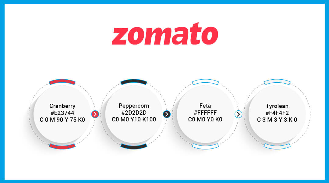
Two of the company’s four official colours can be seen in the logo. These are White Feta (#FFFFFF) and Red Cranberry (#E237440). Additionally, the red colour in the symbols has a gradient: it starts off light in the upper portion, grows progressively, and finally becomes a deep, dark shade at the bottom.
Zomato Color Codes:
Overall the design of the Zomato logo is sleek and minimalist, which adds to its modern feel. The typography used in the logo is simple and easy to read, with bold letters that make the brand name stand out. The logo’s overall shape is also visually appealing, with a rounded square that gives the impression of a seal or stamp of quality. Overall, the Zomato logo is an excellent example of effective branding. It is simple, modern, and memorable, and it perfectly represents the food delivery industry. The combination of red and white is striking and easily recognizable, making it an excellent choice for a brand that wants to stand out in a crowded market.
Swiggy
A well-known and easily recognized symbol that is simple, bold, and memorable. If you look closely at their logo, the symbol is a “S” and a map marker, which is very pertinent to the brand’s delivery-based operation.
The Meaning of Swiggy Logo
The Swiggy logo effectively advertises the firm because of its creative use of colors and symbols. It not only provides a subtle suggestion about the sector in which the company operates, but it also facilitates the acquisition of new business.
The logo for Swiggy combines a wordmark with an icon. The icon, which represents the name of the brand with a large, fashionable “S”, is the most striking element of the design. It makes the brand stand out and is more distinctive.
And there’s no denying that it has a lot of significance. Besides representing the brand’s name, the stylish icon creates a geographic emblem that connects to the company’s operation or service.
The wordmark doesn’t appear to be as distinctive as the solo emblem. It’s a sombre sans-serif typeface with traditional proportions and consistently thick lines.
However, in this instance, the basic font works best because it doesn’t overshadow the “S” icon, which is the Swiggy logo’s most crucial component.
Overall, the word mark’s primary aim, in this case, is to simply expose the brand’s name to potential buyers, whereas the icon has more complex purposes of conveying a subliminal message. The final result is a decent contemporary typeface that is legible at any size.
Typeface
The typography used by Swiggy is based on a Futura typeface that has been changed. There were several letter variations that were utilized exactly, like “W” and “Y”. Minor adjustments have been made to others, such as the “G”s square bottom stroke, which lacks any protruding parts. The upper part of the “S” in the inscription was lowered, and the remaining characters were changed to suit individual needs.
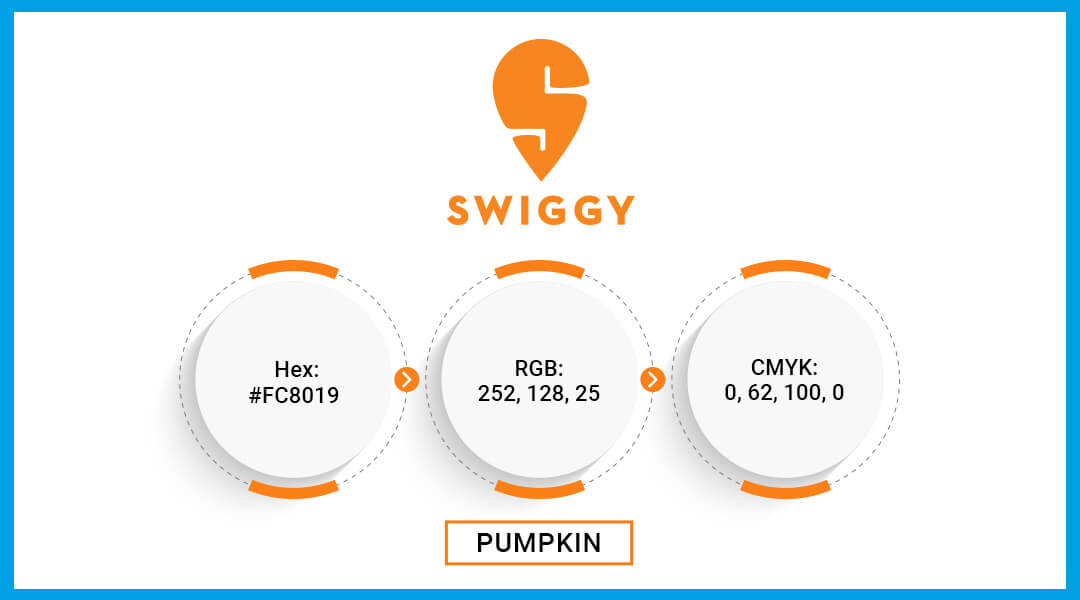
Colors
The primary justification for using the color orange is that, like the colours red and yellow, it tends to make people feel hungry. Some highly skilled marketers assert that these colours increase our hunger. Therefore, businesses use it as a strategy to evoke feelings of hunger in viewers of their logotypes.
Numerous leaders in the fast food industry, including McDonald’s, Burger King, and Wendy’s, have used hues from the red to yellow spectrum. The Swiggy logo’s orange colour lies halfway between red and yellow, therefore, in a way, it combines elements of the two colours.
The color orange is thought to stimulate the brain. It also increases mental activity, which frequently makes people feel hungry. Additionally, according to psychologists, this shade of orange gives Swiggy yet another benefit from using it in its logo. It has the hue of turmeric, which is very well-liked in India.
Swiggy Color Codes:
In conclusion, the Swiggy logo is a great example of effective branding in the food delivery industry. Its design is unique and memorable, making it easily recognizable to customers. The use of the color Orange, which is associated with youthfulness, energy, and happiness. They inspire creativity and uplift people’s moods, and are a great choice for a brand that aims to provide customers with an unparalleled food delivery experience. It is no wonder that the Swiggy logo has become an integral part of the brand’s identity and has contributed significantly to its success in the highly competitive food delivery industry.
ORM, Virtual Financial Services, ATL/BTL Marketing, Project Management, Brand Management, SEO, Web & App Development and much more.
*Your details are safe with us. We do not share or spam our valuable visitors*
Interested to find out how we could help you? Drop in your email and number and we’ll get right back!
Source- Fluidscapes
We are one of the best digital marketing companies in India that provides online reputation management services to all types of organizations. We assist businesses to stay on top of the game by leveraging the latest technologies and breakthroughs in marketing strategies and business processes. Want to grow your business, even more, get in touch with us and we’ll tell you how.
POPULAR BLOGS

TOP 5 Domains of AI Insider Secret
As AI continues to be among the most talked about subjects of modern times and …

How an ORM Agency Can Help Protect and Enhance Your Online Reputation
Your reputation is your best asset, for an individual or for a business. The question …
ORM Agency vs. In-House Reputation Management: Which is Right for You
While ORM (Online Reputation Management) is seen as the backbone of a business’s branding strategy, …